CAKE Elakiri
A POINT OF SALE DESIGNED WITH THE RESTAURANT SERVER IN MIND
THE CHALLENGe
CAKE’s core product is a Point of Sale system that was initially developed for any business, but, after seeing early success in restaurants, became a product targeted to that industry. With our proprietary hardware, this system is robust and reliable, but it lacks some of the speed and gesture support of tablet-based systems. Our challenge was to explore what a tablet-based system could do for our restaurant operators. In what ways could we improve upon the point of sale experience? Tablets are not known for being sturdy. Could we make our software enticing enough for full-service restaurants to risk using a tablet as the technology at the heart of their business? That’s what we wanted to find out.
The current CAKE Point of Sale
THE PLAN
This was a good time to realize that we didn’t know what we didn’t know. We chose to do exploratory research to see and hear just that: what were we not considering that affected our restaurant POS users on a day-to-day basis? We kept the team small and light, one product manager, one UX researcher/designer (that’s me!), one visual designer, and (initially, at least) one engineer. As the UX researcher, I wanted to keep everyone as involved as they wanted to be, so any site visit, interview, card sort, or usability test was open to the whole team. I was thrilled that they often decided to join me on these.
USER RESEARCH
Focusing on our current users, I set out to do exploratory research with as broad a swath of users as possible. In total, I interviewed around 50 users, including owners, managers, bartenders, servers and chefs. I spent hours in their restaurants, watching work flows, looking for disparities, and occasionally refilling napkin holders. It only seemed right.
From these observations we created a few different artifacts. These included the following:
A heat map of ideas
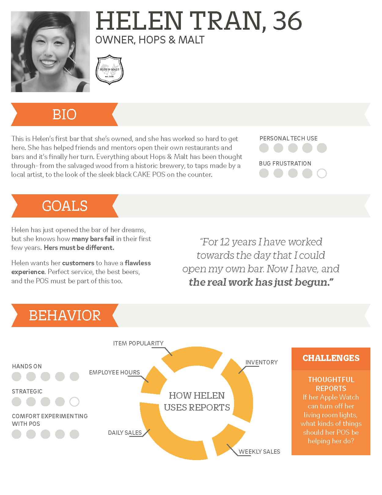
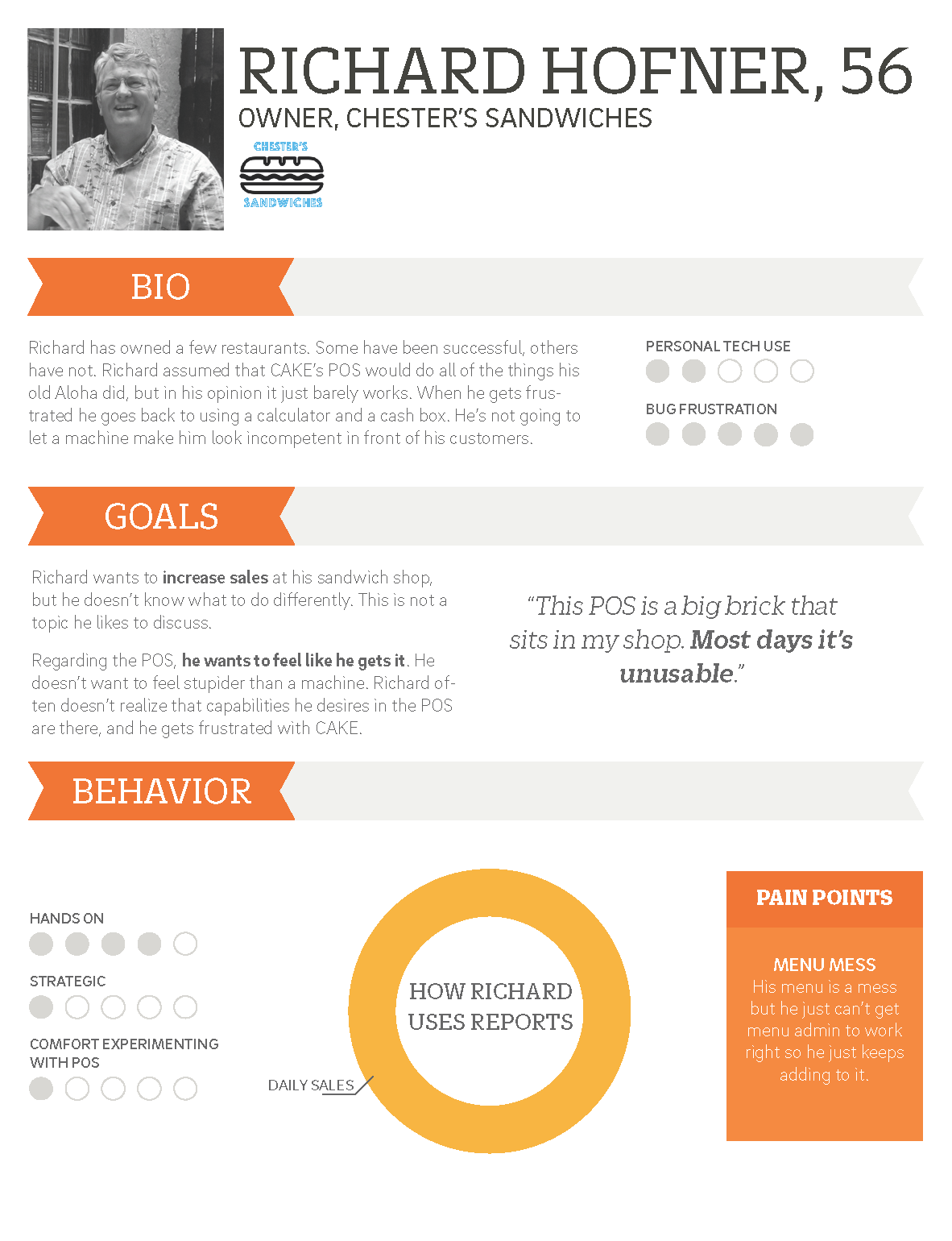
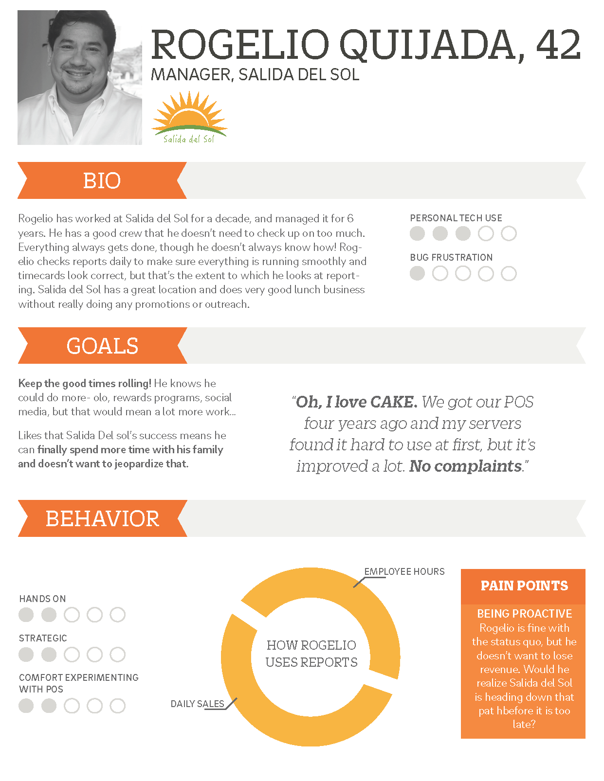
Personas
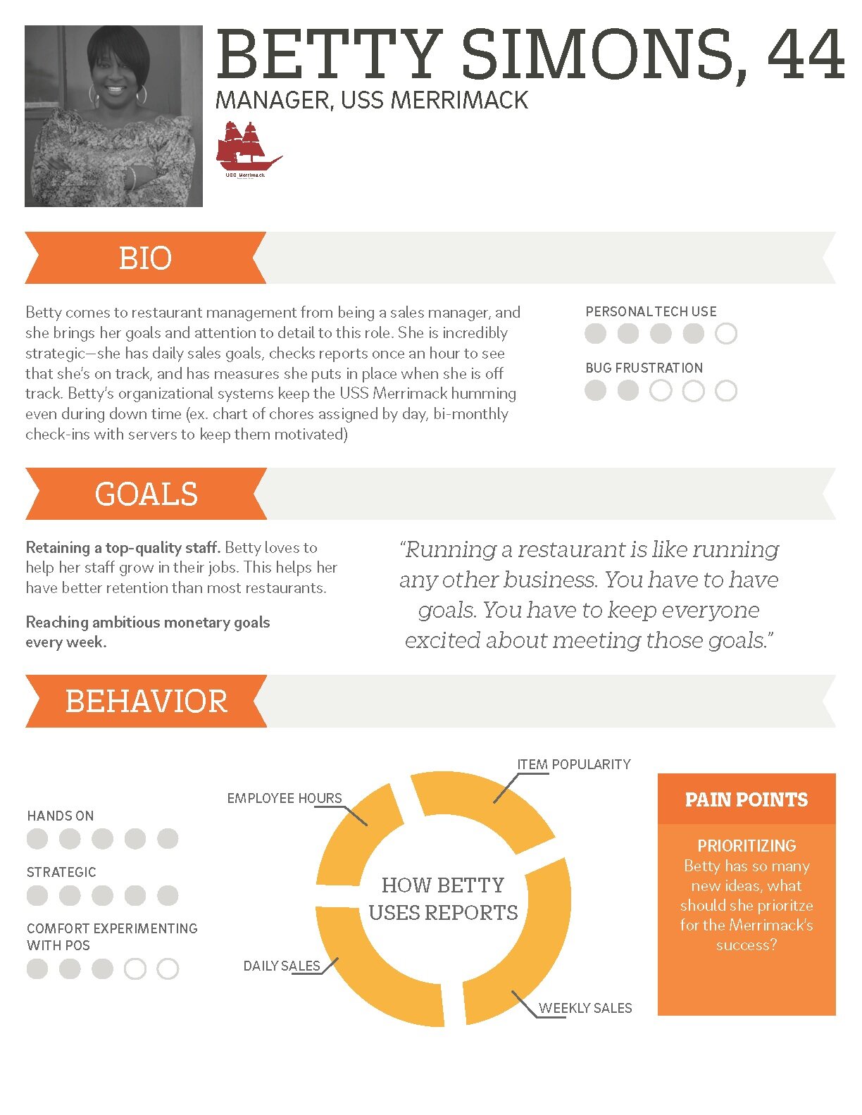
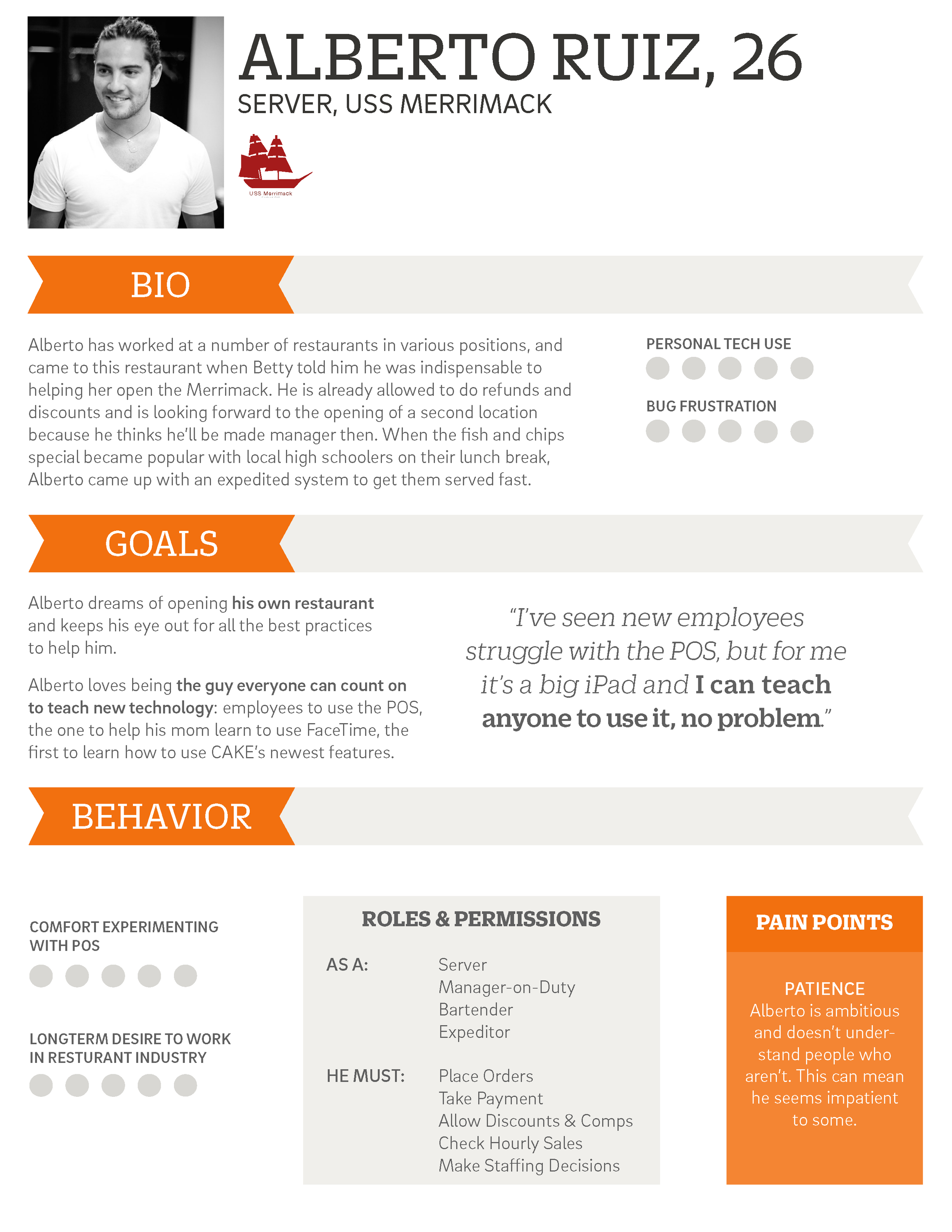
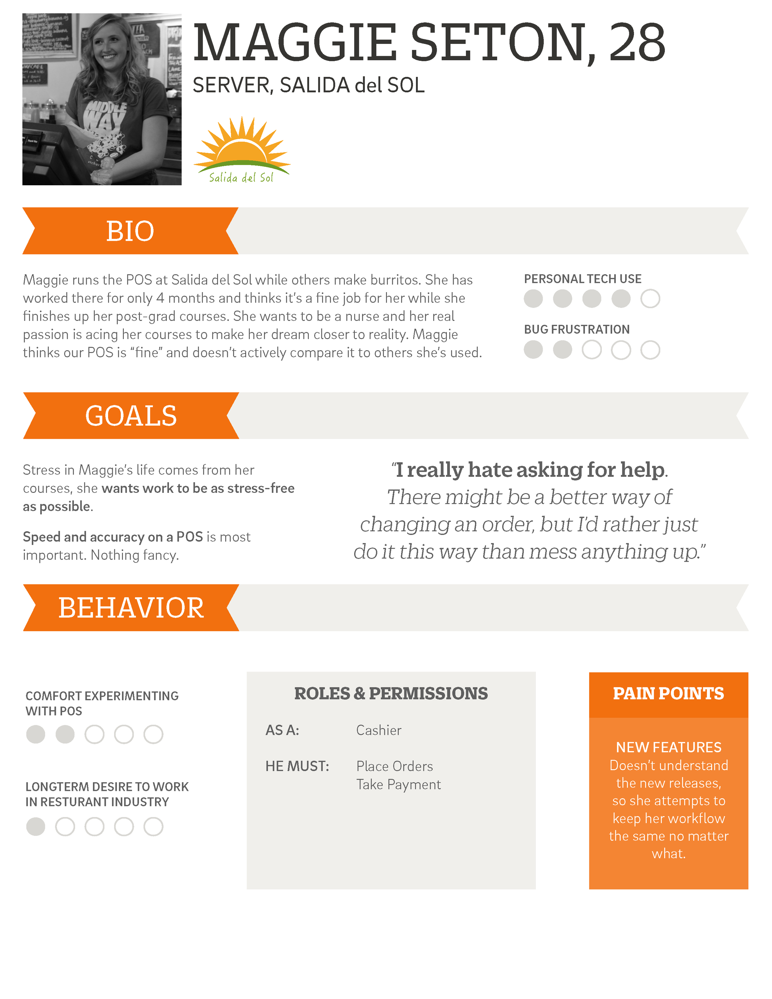
A journey map of the onboarding process
DESIGN PRINCIPLES
Speed up order entry for our power users
Knowing the best servers could enter entire orders without once looking a screen, we designed a system where items could be grouped in ways that made sense to the server, rather than just by filling in rows. Below you can see an example where a server has grouped the chicken appetizers to one side, making order entry more intuitive.
Note: This image is in wireframe stage and does not reflect final designs
Help inexperienced servers stay on top of their game
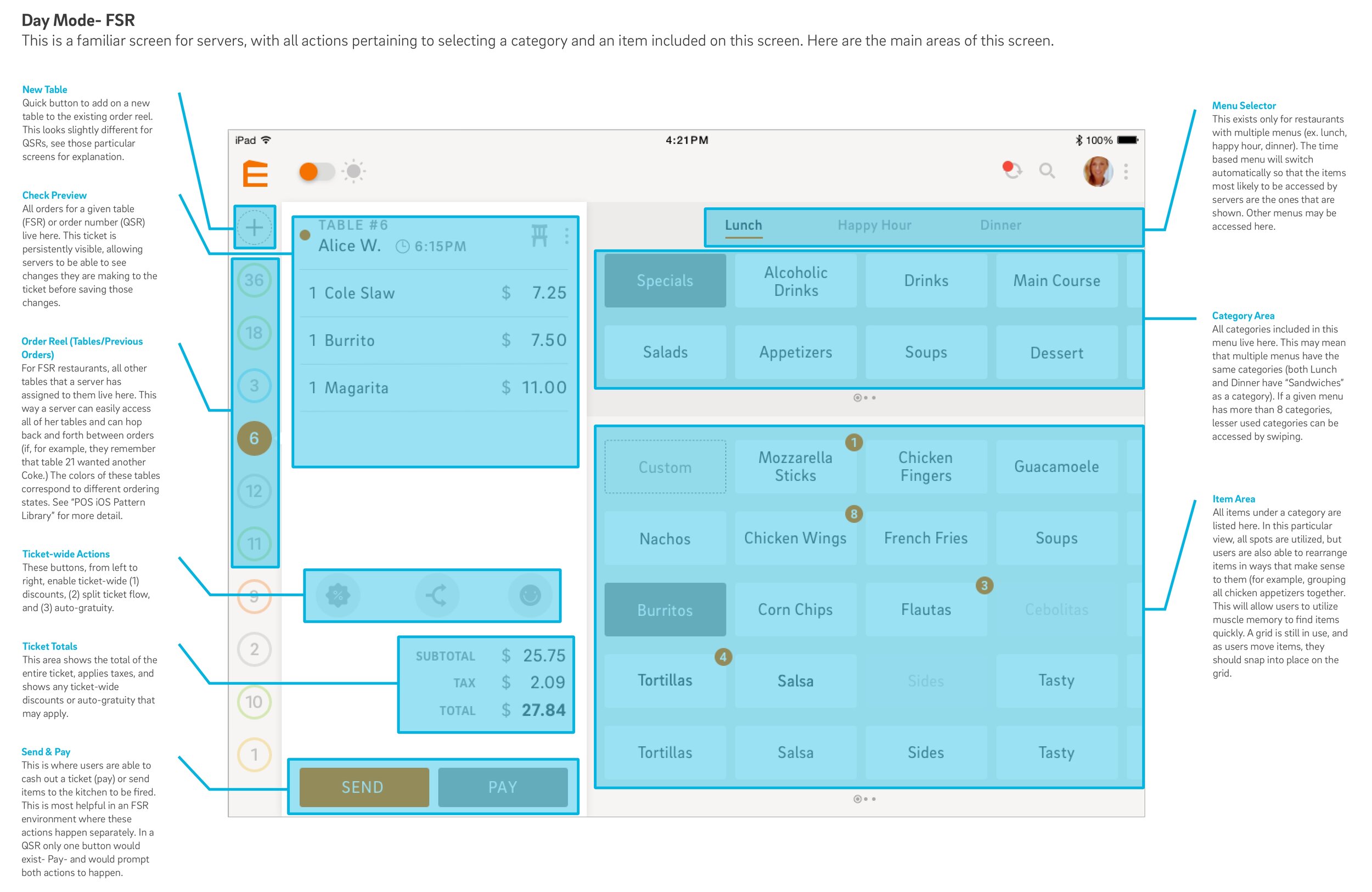
One of the striking differences between a seasoned server and a brand new server was the ability of a veteran to keep so much changing information clear in their heads. Table 4 doesn’t want their soup till everyone else gets their pastas, Table 8 might need a refill on drinks. It’s just so easy to drop one ball. We wanted our POS to simulate that rapid changing of statuses that comes so naturally to the seasoned server. Our answer was the order reel.
The “order reel” displaying all of a server’s open tickets as well as color coding them to provide immediate context
Use touch gestures for speed and delight
By allowing power users to utilize the long press to pull up additional options, we were able to create fun ways to access some of the lesser-used actions on the POS.
The End Result
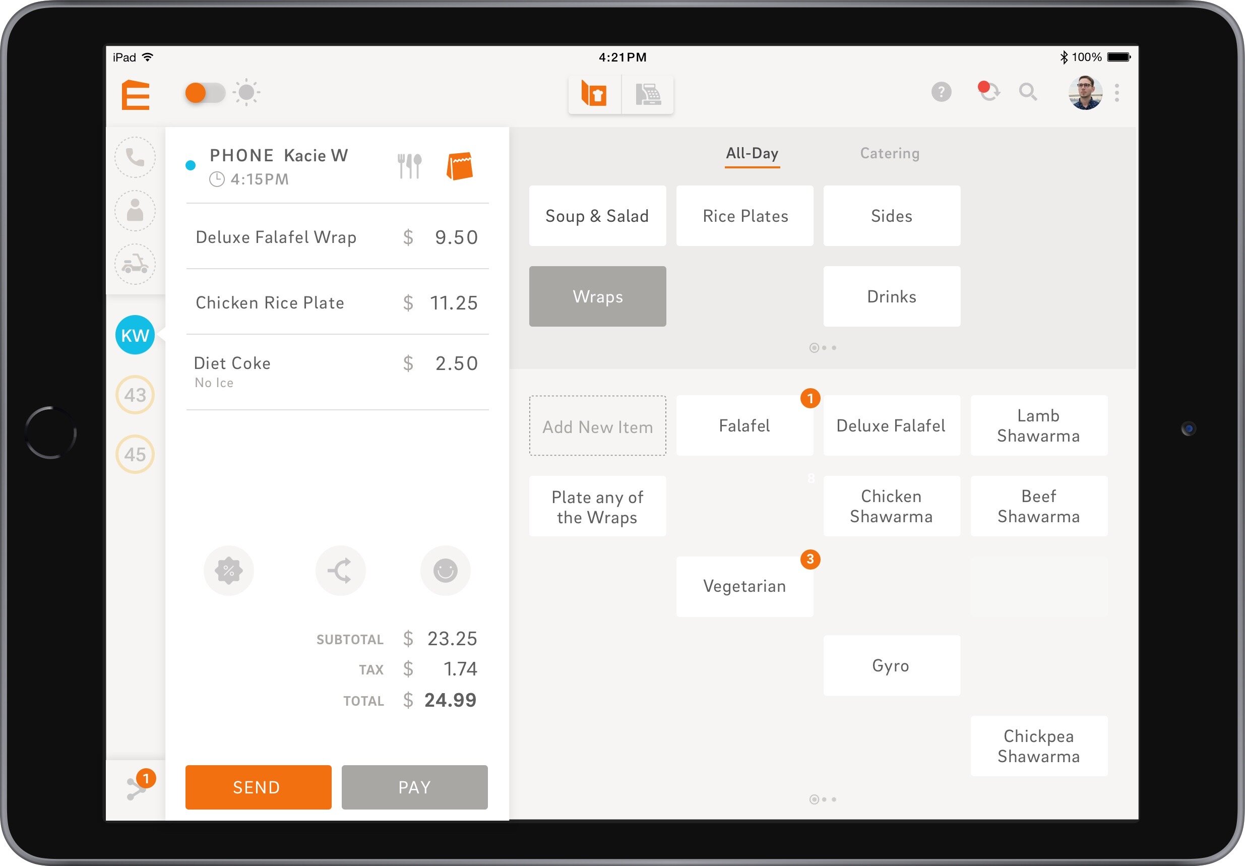
Main ordering screen with an open ticket
SHARING OUR IDEAS
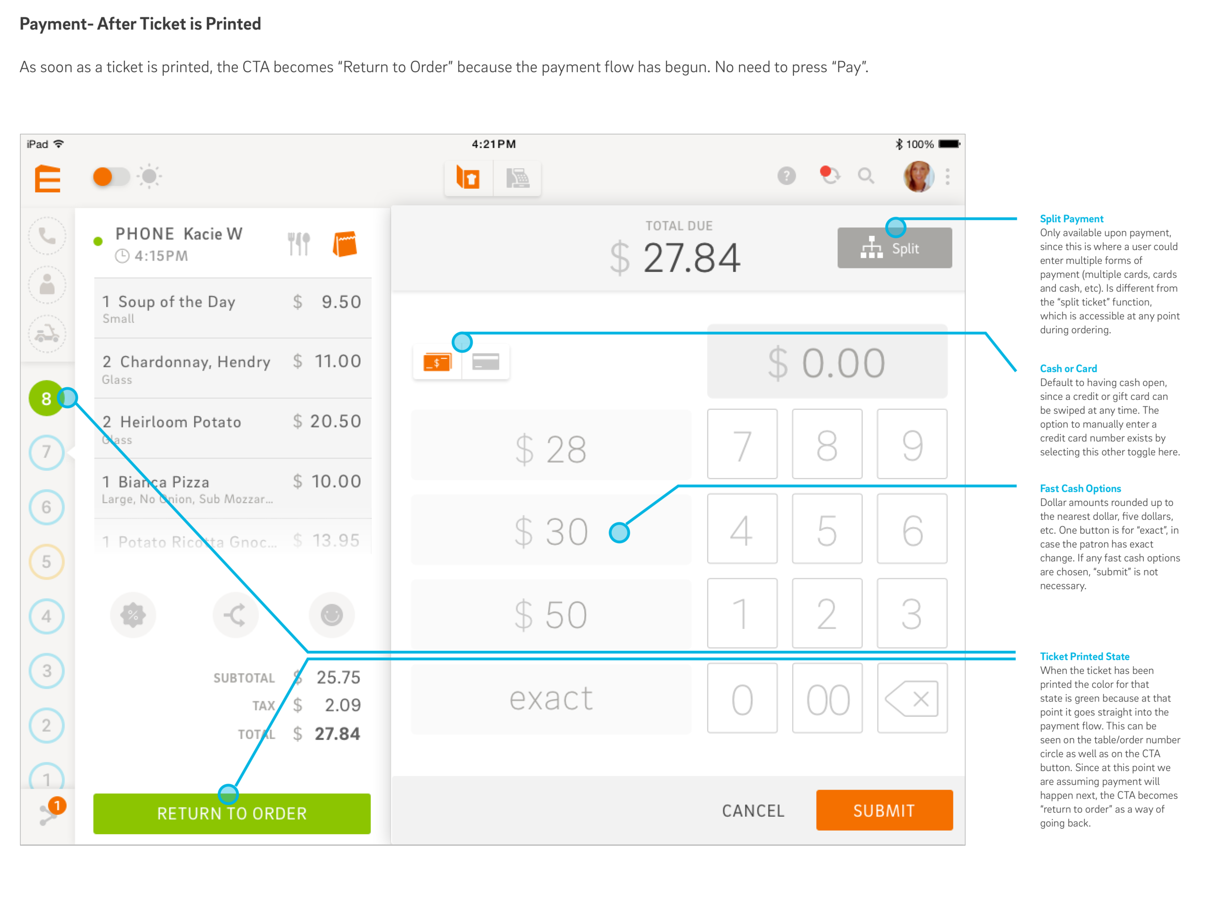
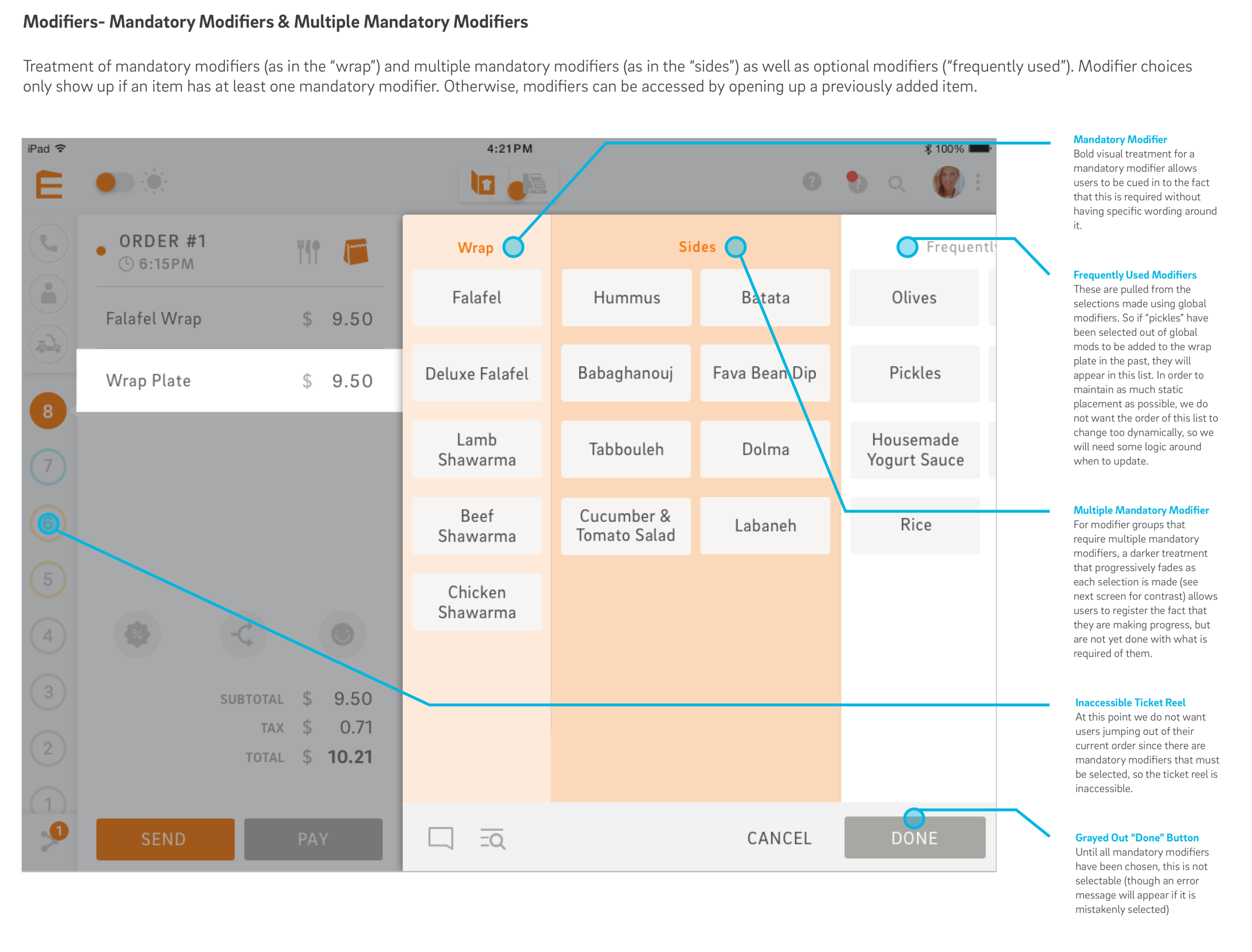
We kept meticulous track of our decision-making, and wanted to share justification for every part. With pages of documentation for engineers and stakeholders, as well as what we called “spotlight videos” where we would talk through the design thinking of various elements, we were able to pass on all of the thought behind each element of design.
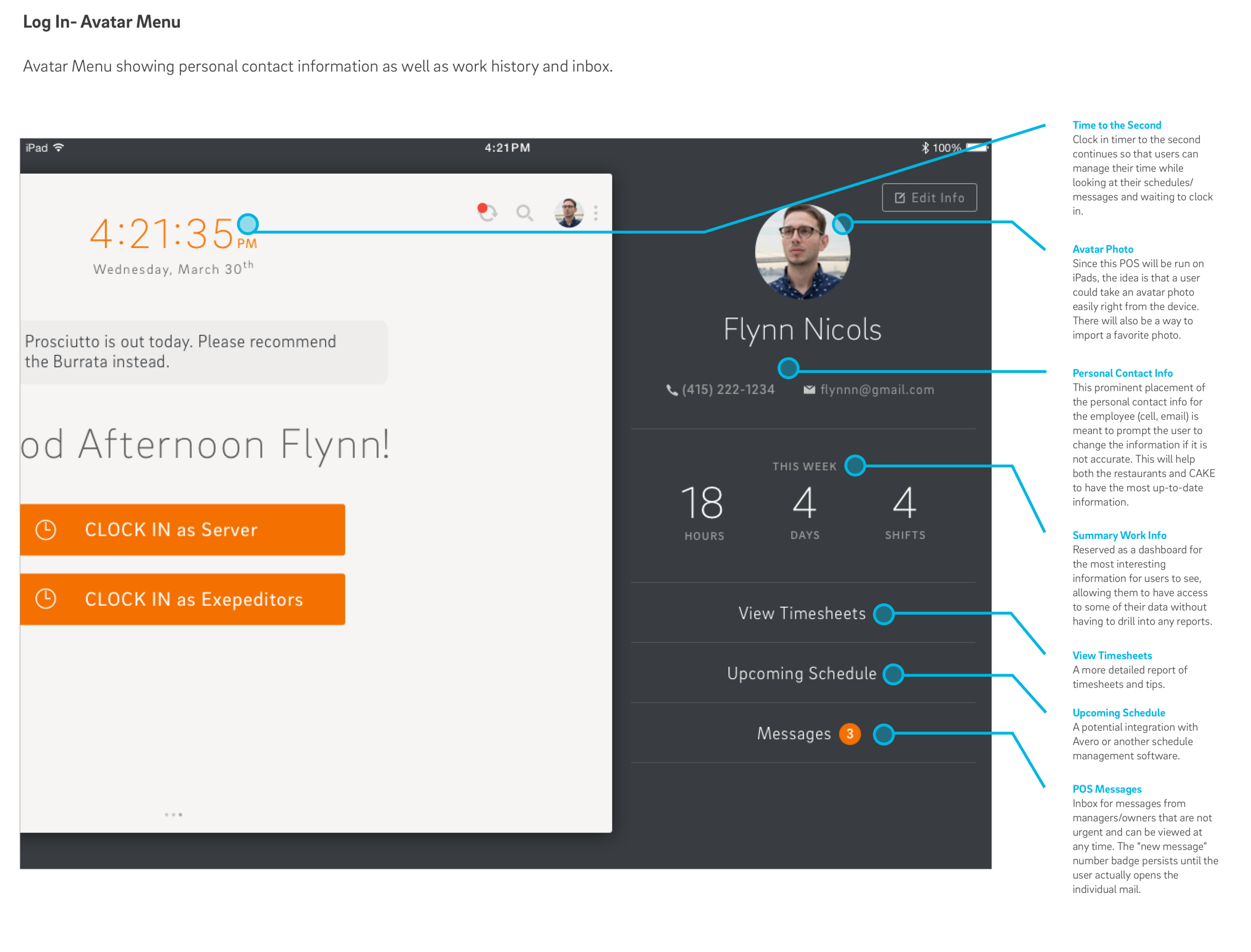
Since our task was not only to envision a new tablet-based POS, but to make that vision understandable to everyone in our company, we sought out as many ways as possible to bring our research to life. One of these ways was in making a research wall, where our coworkers could see our process and interact with the findings.
A colleague examining the research wall


